logos & Icons
When it comes to designing logos and icons, a personal philosophy I use is, I view it as a process of forming relationships between typography, shapes, and colors to create something memorable, simple, timeless, and versatile. Achieving this requires simplicity, ensuring that the design remains clean and effective. A successful logo, icon, or symbol to me, is one where I’ve experimented with various elements, removing unnecessary components to see if the combination remains clever and impactful.
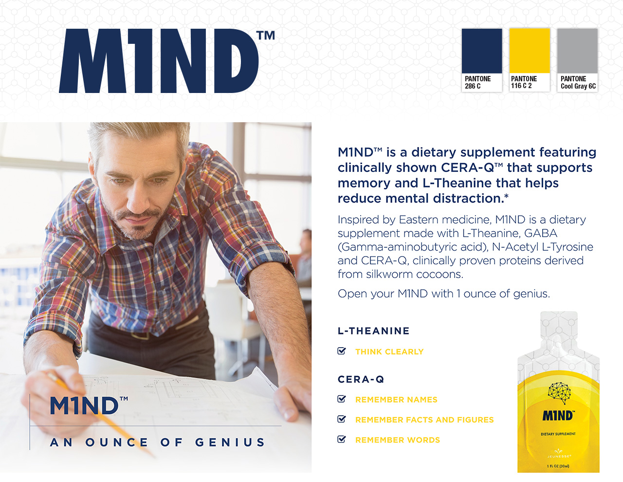
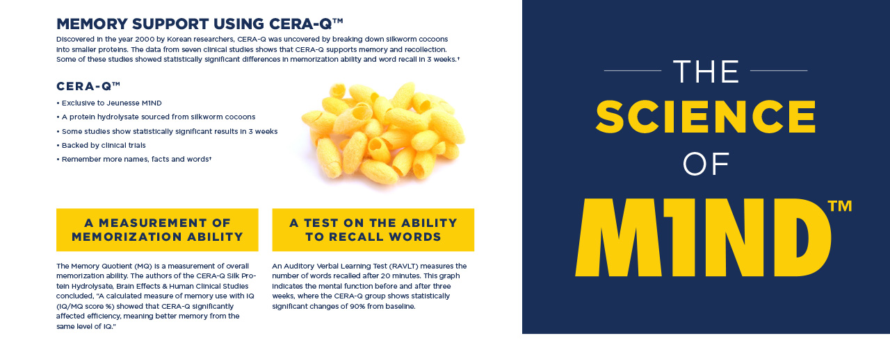
MIND™
Jeunesse Global
Branded M1ND™, featuring CERA-Q™, a dietary supplement clinically shown to support memory and reduce mental distraction, as part of the Jeunesse Products Yes System. Created the logo to incorporated a molecule pattern of a brain and the color yellow to enhance consumer awareness of the citrus lemon flavor and scientific attributes this product offers and its benefits. Selected branded imagery to use for marketing materials that show models performing in environments that need focus.
Furniture logos
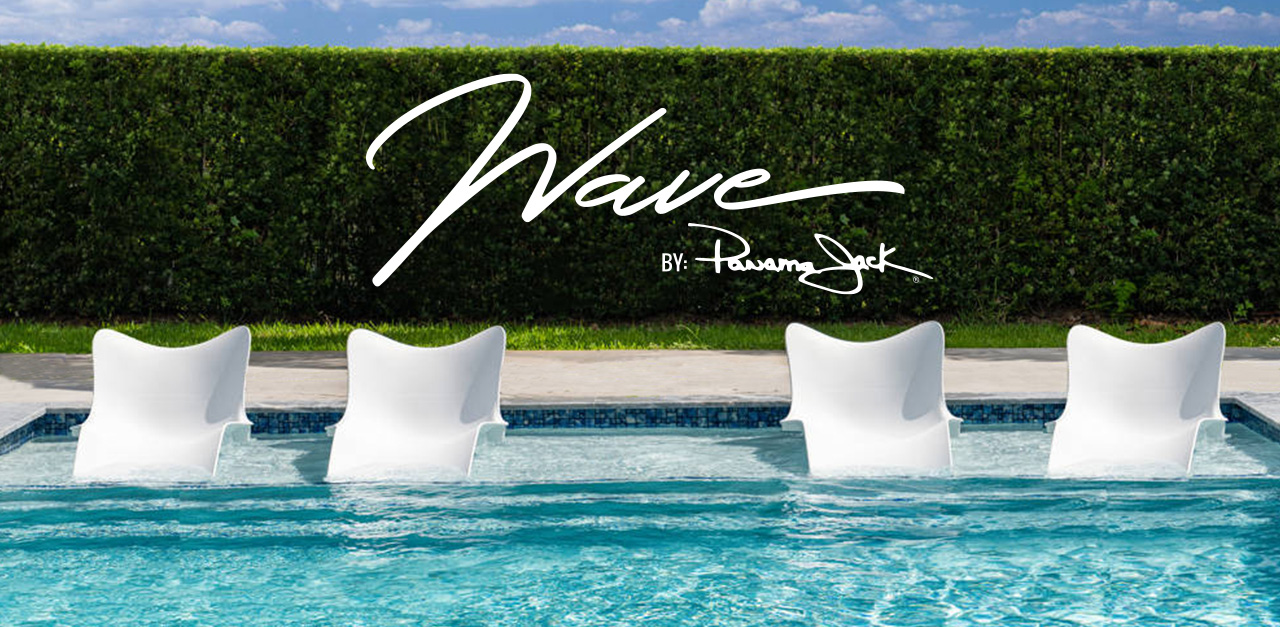
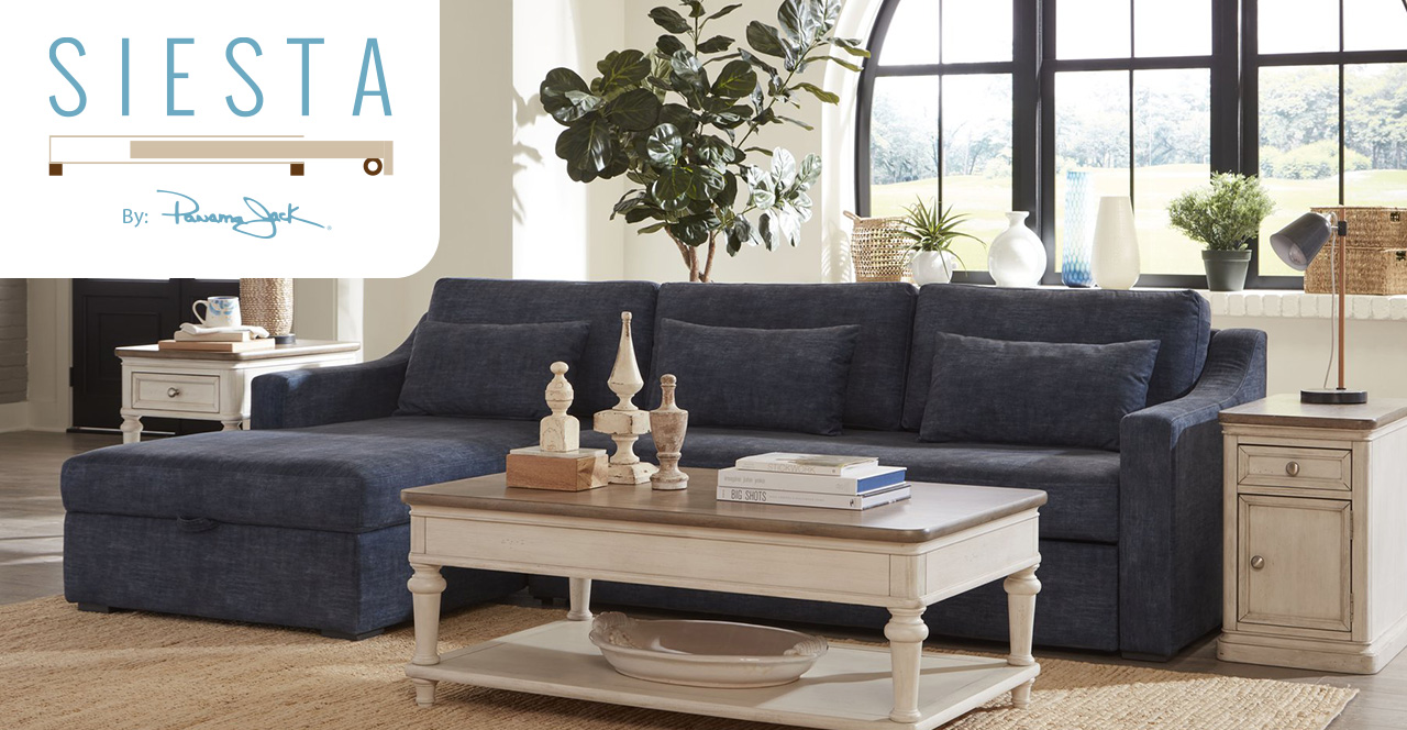
Panama Jack Home
From concept to design, I created a series of logos for Panama Jack’s furniture collection, encompassing indoor, outdoor, and sunroom furniture. These logos were meticulously crafted to resonate with the theme of “Escape Everyday” in the home, aiming to evoke feelings of relaxation, comfort, and a tropical lifestyle associated with the Panama Jack brand. Each logo was carefully tailored to reflect the overall aesthetic and ambiance of the furniture pieces within the collection. Regional names were strategically incorporated to enhance branding and appeal to specific target markets. Utilizing elements and forms from the furniture collections ensured consistency and cohesion across the entire product line.
lifestyle rewards tripS
Jeunesse Global
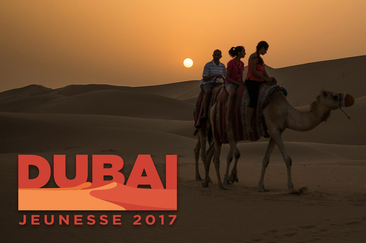
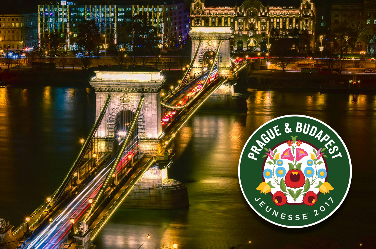
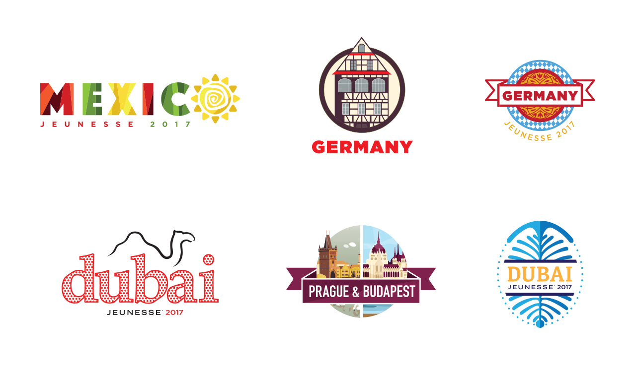
For the top-ranking Jeunesse distributors, I developed logo options for their annual incentive trips in various countries. Presented below are the logo designs for Germany, Dubai, Prague & Budapest, and Mexico. These logos were crafted to serve as the overarching theme for the trip winners, accompanied by promotional materials and swag to ensure a cohesive and unforgettable experience for all participants.
Website Icons
LYNX | Central Florida Regional Transportation Authority
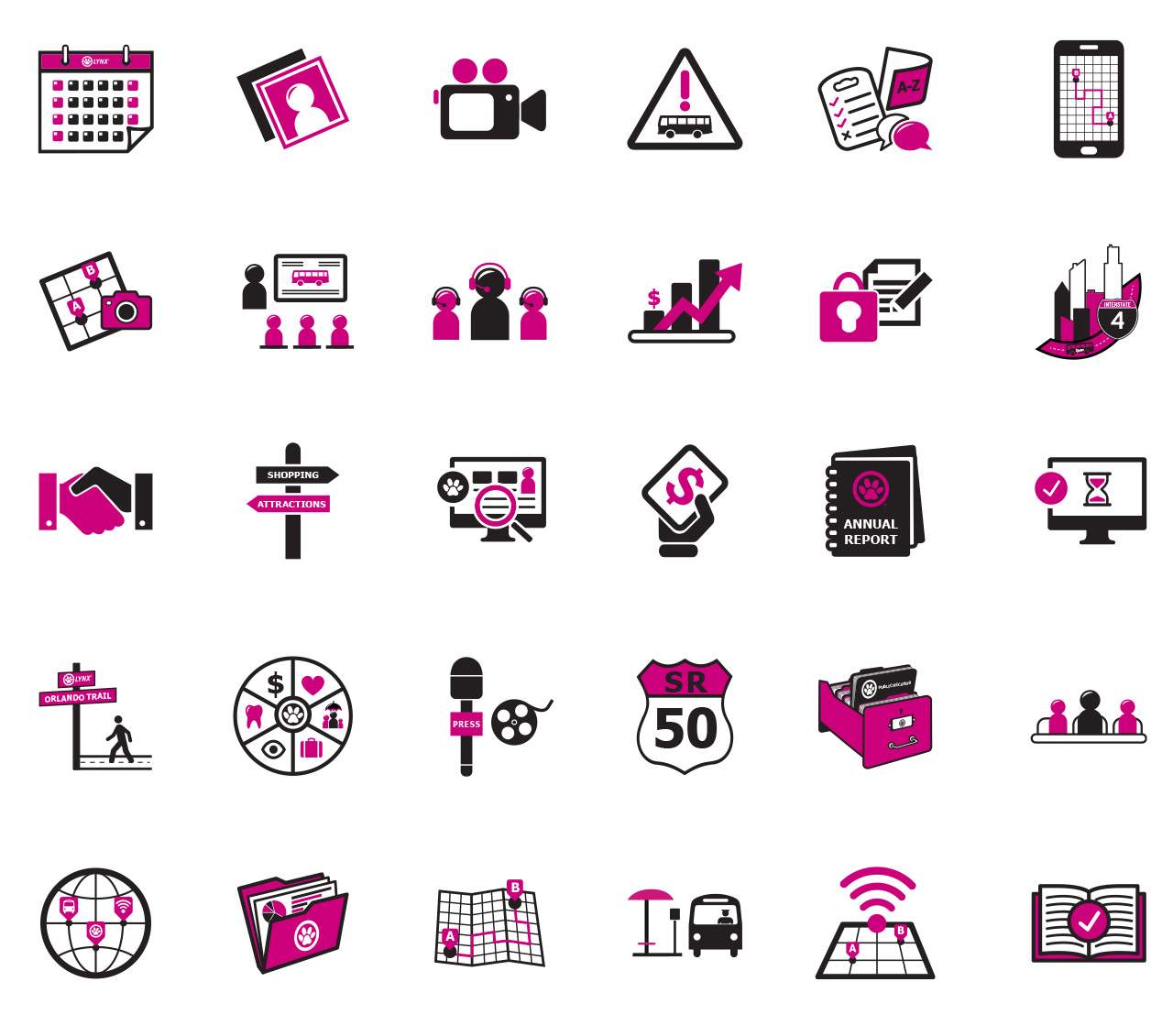
Designed and conceptualized over 30 section header icons for the LYNX corporate website, aiming to enhance user experience and visual appeal. Throughout the design process, I ensured consistency and alignment with the overall brand identity by utilizing the brand’s colors.
Chinese zodiacs
Creating minimalist zodiac sign icons required simplifying shapes and reducing details while maintaining recognizability. This approach resulted in clean lines and basic geometric forms that convey the symbol’s essence with minimal elements, achieving a sleek and modern interpretation.
Other Collections
digital marketing
Signage
Logos & Iconography
inquires
Location
Orlando, FL.
lindsayjagnew@gmail.com
